You may have already chosen your paint colour scheme but feel it lacks a little something, or you might have a scheme that's still working, but looking tired. This is where our accent colour ideas come in.
But how do you choose an accent colour? 'The 60-30-10 rule is an easy rule-of-thumb to help you achieve balance and harmony in a room’s colour scheme, encompassing not just the paint on the walls but all the furnishings and fittings too,' says Jo Plant, head of design at Pooky.
'Quite simply, you select three colours and use them in the room in those proportions. So 60% of the room will be made up of the main colour (very often a neutral) – perhaps your walls, ceiling and larger items of furniture such as a sofa.
'Your second colour will account for half as much as the first – so, 30% of the room’s overall appearance. Perhaps curtains, a single wall, a fireplace, painted furniture or a rug. Finally, the last 10% will be made up of your accent colour. Without an accent colour an interior can actually feel quite ‘flat’, so judicious use of a third colour can really bring a room to life.'
Now that you have that formula to follow with the help of colour experts we've rounded up some of our favourite accent colour ideas to inspire your next home makeover.
Accent colour ideas
Accent colours can be light or dark, it all depends on the main colour that you've picked. 'But, if you’re hesitant to go too bold, then consider a muted pastel shade instead. Tones like soft peach or lilac on areas such as skirting boards and architraves can really help to bring a room to life, alongside creating a seamless flow,' says Emma Bestley, co-founder of YesColours.
Our accent colour ideas below cover a variety of choices from dark and dramatic, to delicate and elegant.
1. Create a dramatic hallway with charcoal
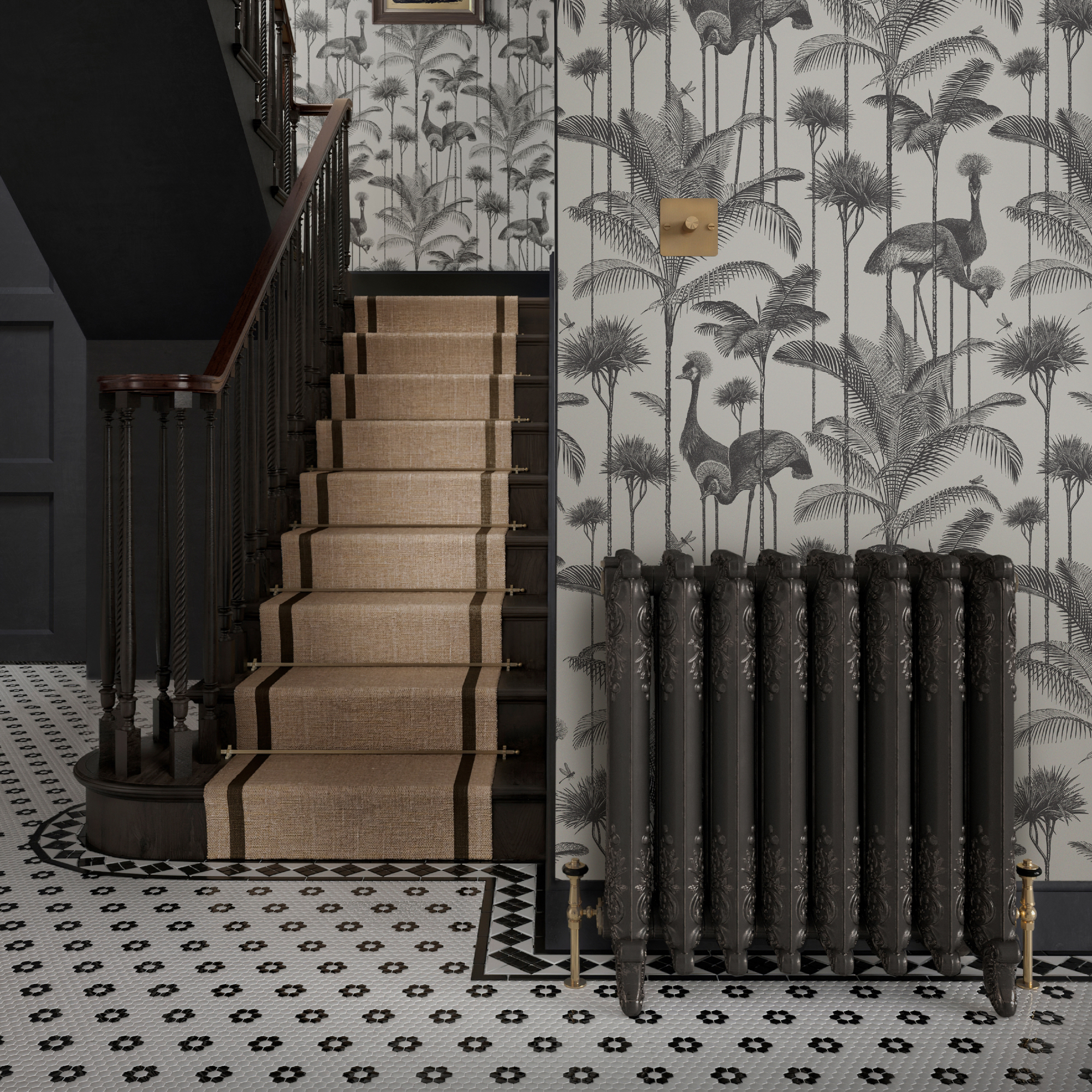
With hallways being the first port of call for welcoming visitors, why not pair a bold accent colour with your hallway colour scheme?
'We wanted to create a demure but bold statement in the hallway of this traditional Victorian property marrying the charcoal paint in the woodwork with our Crane Fonda wallpaper, which strikes an ever so slightly exotic note,' says Jamie Watkins, co-founder of Divine Savages.
'Additionally, charcoal pairs beautifully with a wide range of accent colours such as vibrant mustard yellow for a modern look, or for a more classic and refined aesthetic opt for accents in crisp white.'
2. Give your space a lift with sunshine yellow

Yellow is a particularly good choice for a north facing space as it can warm up a 'cool' room.
'Blue and yellow are located opposite each other on the colour wheel and hence adding yellow soft furnishings to a mainly blue living room, really creates a vibrant contrast and enlivens the space,' says Debbie Leigh, design manager at ILIV.
If the thought of a large element of yellow is daunting then consider small pieces first, 'Accent colours can be incorporated using smaller items such as cushions and decorative accessories or consider an upholstered piece of furniture or a statement set of curtains for a real wow factor,' adds Debbie.
3. Pick a soothing aubergine
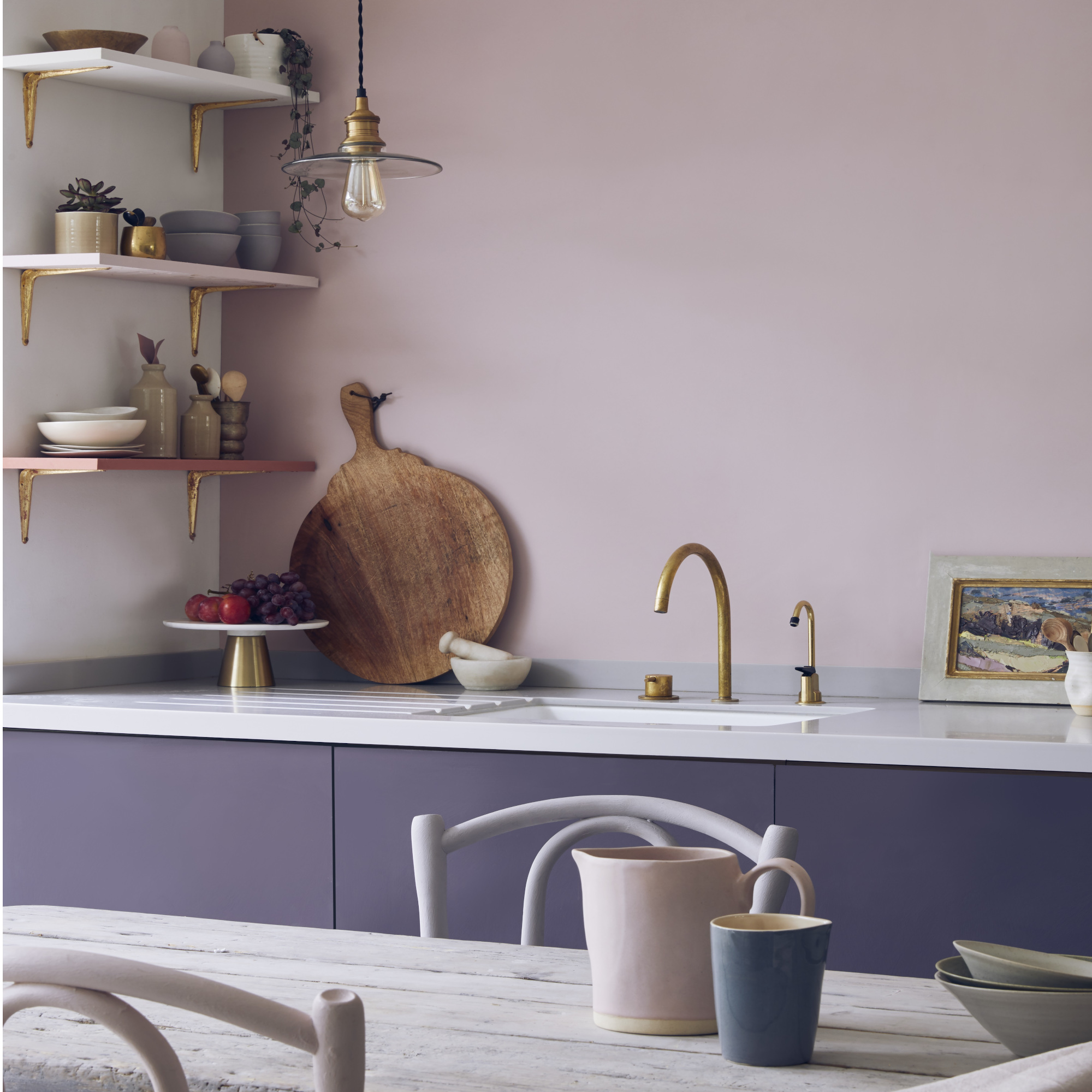
Kitchen colour schemes can be hard to choose, start with a subtle shade that could really benefit from an accent colour to enhances it. Aubergine goes really well as an accent colour, if you're painting it on cabinets then a darker tone will ground the space.
Paint and colour expert, Annie Sloan CBE, says, 'Spice up your serene kitchen with a dash of aubergine on the cabinets! Picture a pale purple paradise, calm and dreamy, then BAM – bold aubergine cabinets adding flair and drama. It's like adding a sprinkle of magic to your space, making it uniquely, boldly, completely you. Plus, since Chalk Paint applies to any surface you can spread the aubergine love with little accents throughout. On flooring, on metal, on wood, on plastic, the only limit is your imagination.
You could also paint your chairs or table top to take your accent shade further.
4. A perfect peach
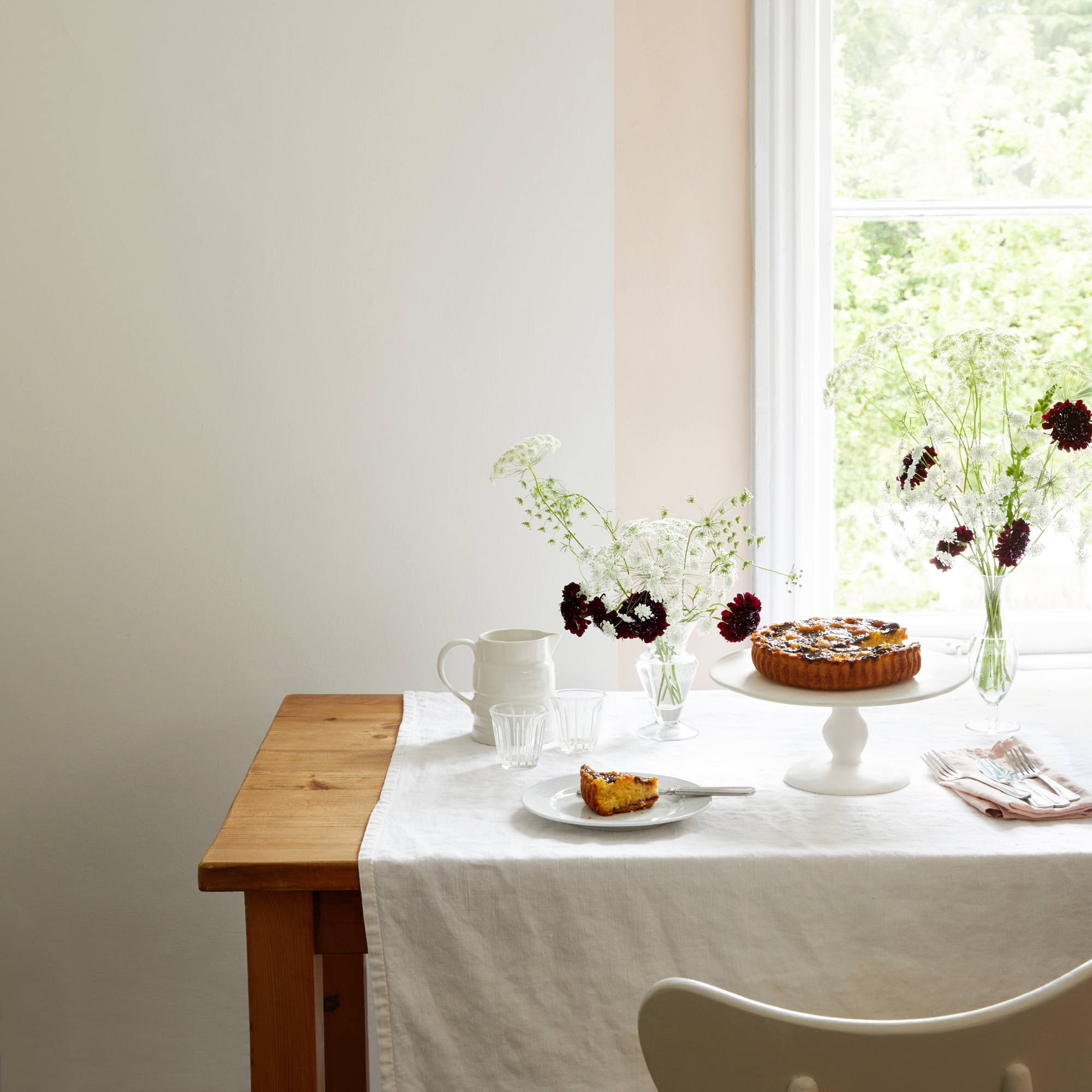
We tend to think that accent colours should be bold and punchy, but they can also be subtle and elegant.
'Accent colours can be lighter or darker, depending on the look you want to achieve,' says Bailey Oates, colour expert at Earthborn. 'If painting a small kitchen or one with low ceilings, then a lighter accent colour will create the sense of a larger, airy space.'
Peach is a pretty option to team with off white, it's enough to give a hint of colour that will gently warm up a white scheme. Paint a section around your window and choose matching napkins or tableware to tie the look together.
5. Use a bright teal in a red study
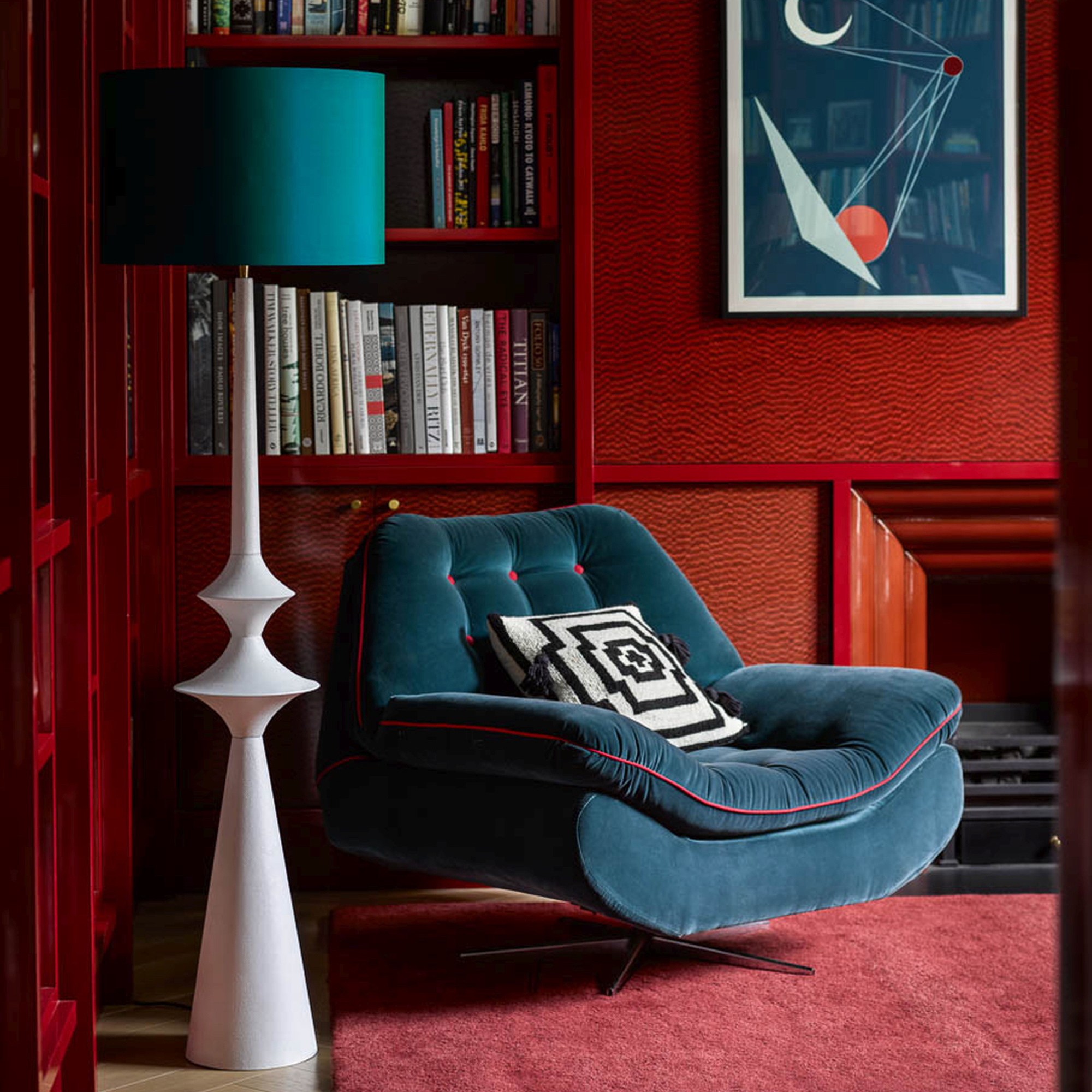
For a punchy primary red living room or snug you'll need to pick an accent colour that adds a fabulous contrast and a style statement to boot. Teal is a great choice, start small and then add another two or three elements.
'Sneaking an accent colour into a room is great fun but can often be a bit of a challenge – which is where table lamps can be your friend,' says Jo Plant, head of design at Pooky.
'With a bit of clever thinking, a well-chosen table lamp and shade can fulfil a double function in your scheme: it can provide one of your three kinds of light (ambient, accent or - if you use it to read by - task lighting), and it can also be a practical way to introduce an accent colour.'
6. Complement a calming scheme with mint green
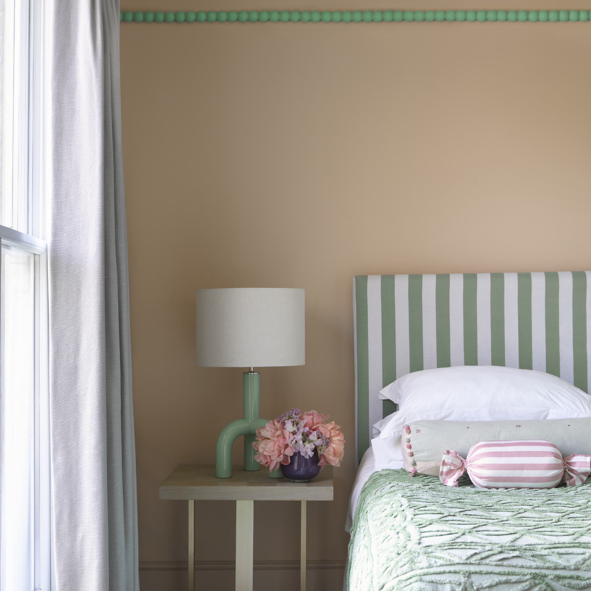
Accent colours can also be set perfectly between light and dark tones and a mint green is a great place to start when your base colour is white, stone, or pink.
'Green is a hugely versatile colour, whether you want to use it as an accent or to take centre stage, there is a shade for everyone. Paint walls in a tranquil pink hue to set a restful mood then inject pops of bright mint green to lift the look to the next level,' says Helen Shaw, director of marketing (international), Benjamin Moore.
Another way to make accent colours boost your scheme is where you place them, for example, if your bedroom ceiling is low, then add a painted picture rail – it will help to draw the eye up. Use the colour in your bedding and accessories too for cohesion.
7. Lift a neutral kitchen with zesty orange
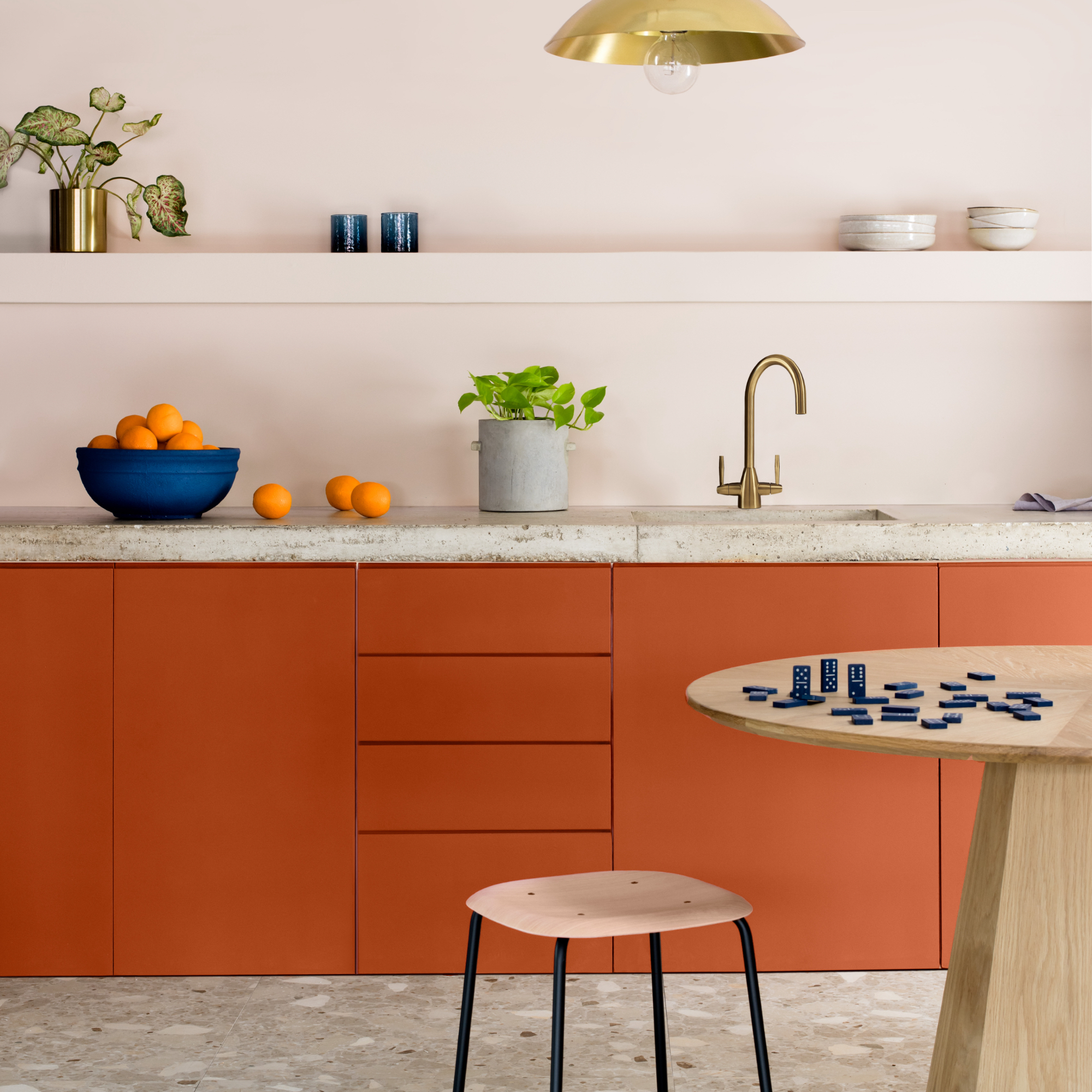
Perk up a tired kitchen with a vibrant orange that will lift your mood and ensure the space feels cheerful and fun.
'Delight your senses by injecting a playful splash of colour to create accents within your scheme. It’s amazing what a difference a pop of colour can make and it could be exactly what your room is missing,' advises Emma Bestley, co-founder of YesColours.
If you're unsure of painting something as key as your cabinets then try the colour out elsewhere instead, or opt for a more muted version of your chosen shade instead.
8. Opt for two accents
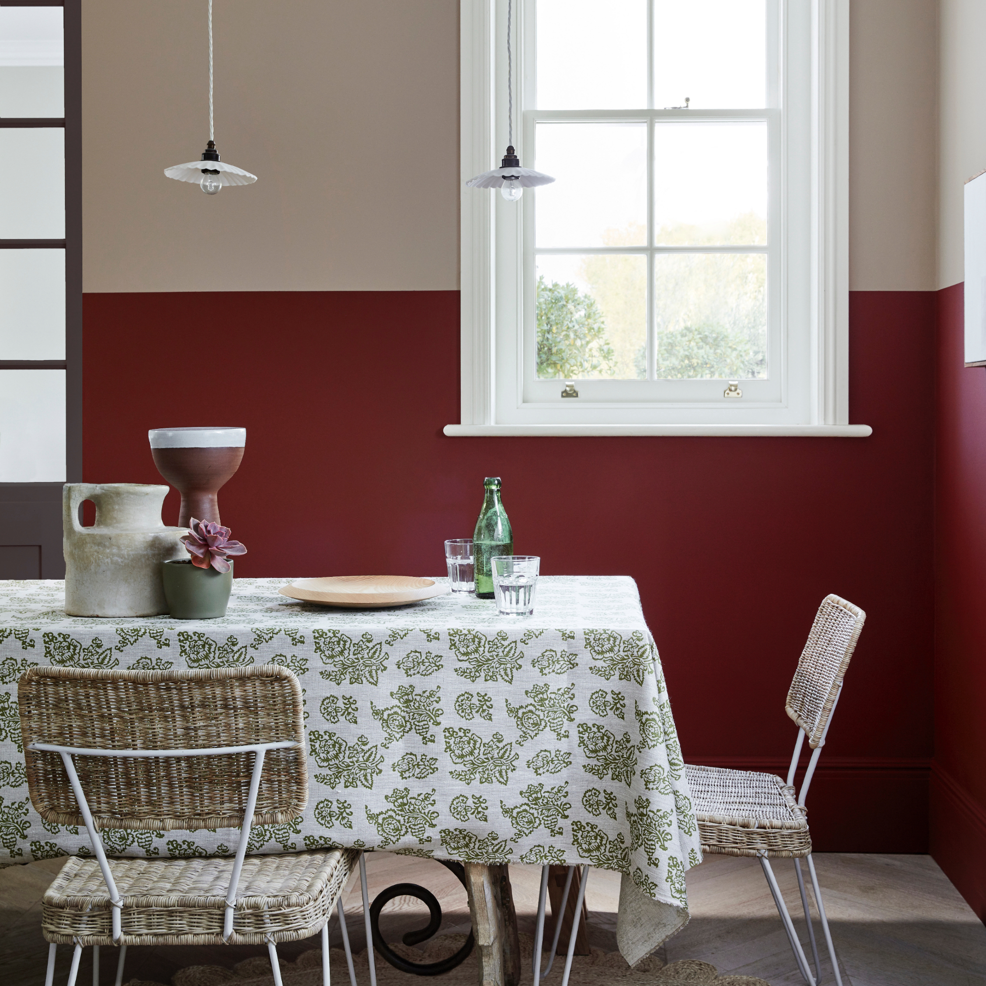
Go the extra mile and use a colour combination of two accents – you can choose a darker shade for the lower half of your wall and a lighter colour for the top half. If you split the proportions equally they'll both be accents.
'Adding an accent colour is a brilliant way of injecting a joyful, unexpected point of interest and a touch of personality to a room, and there are many different ways to embrace this approach within an interior,' says Ruth Mottershead, creative director at Little Greene.
One option is to use the same colour but in different tonal shades – two greys for example, one mid-tone and one lighter, or two contrasting colours. Ruth adds, 'This approach can also be very effective as a contrasting two-tone combination, such as combining the deep red ‘Arras’ at the lower level to bring warmth and comfort, with the warm neutral ‘Rolling Fog’ above to provide a feeling of lightness.'
9. Prettify with ice cream pink
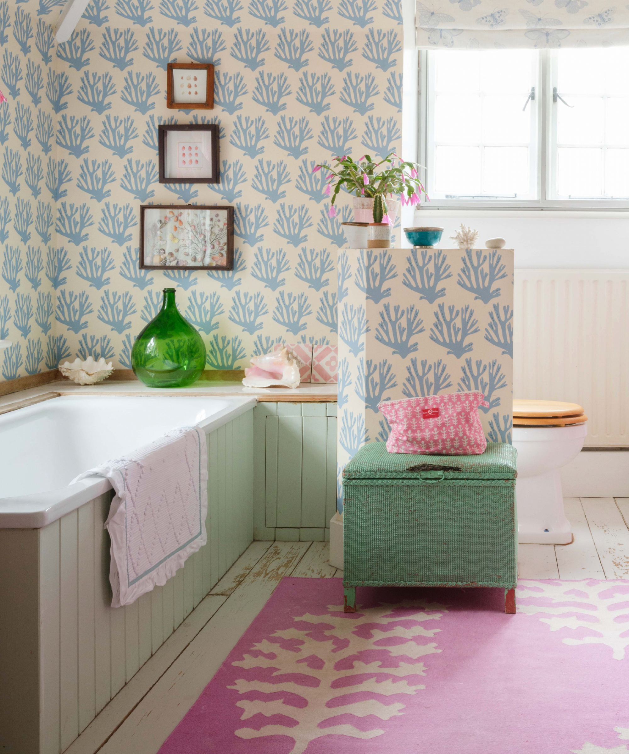
Pastel shades are so easy on the eye and create a charming feel whether it's in wallpaper form or plain painted walls.
If you are leaning into a cottage-style look with your bathroom colour scheme then a sky blue and pale green work wonders with an ice cream pink as an accent. For a cohesive feel, make sure the colours you pick all have the same tonal quality.
10. Create a cosy feel with cobalt blue
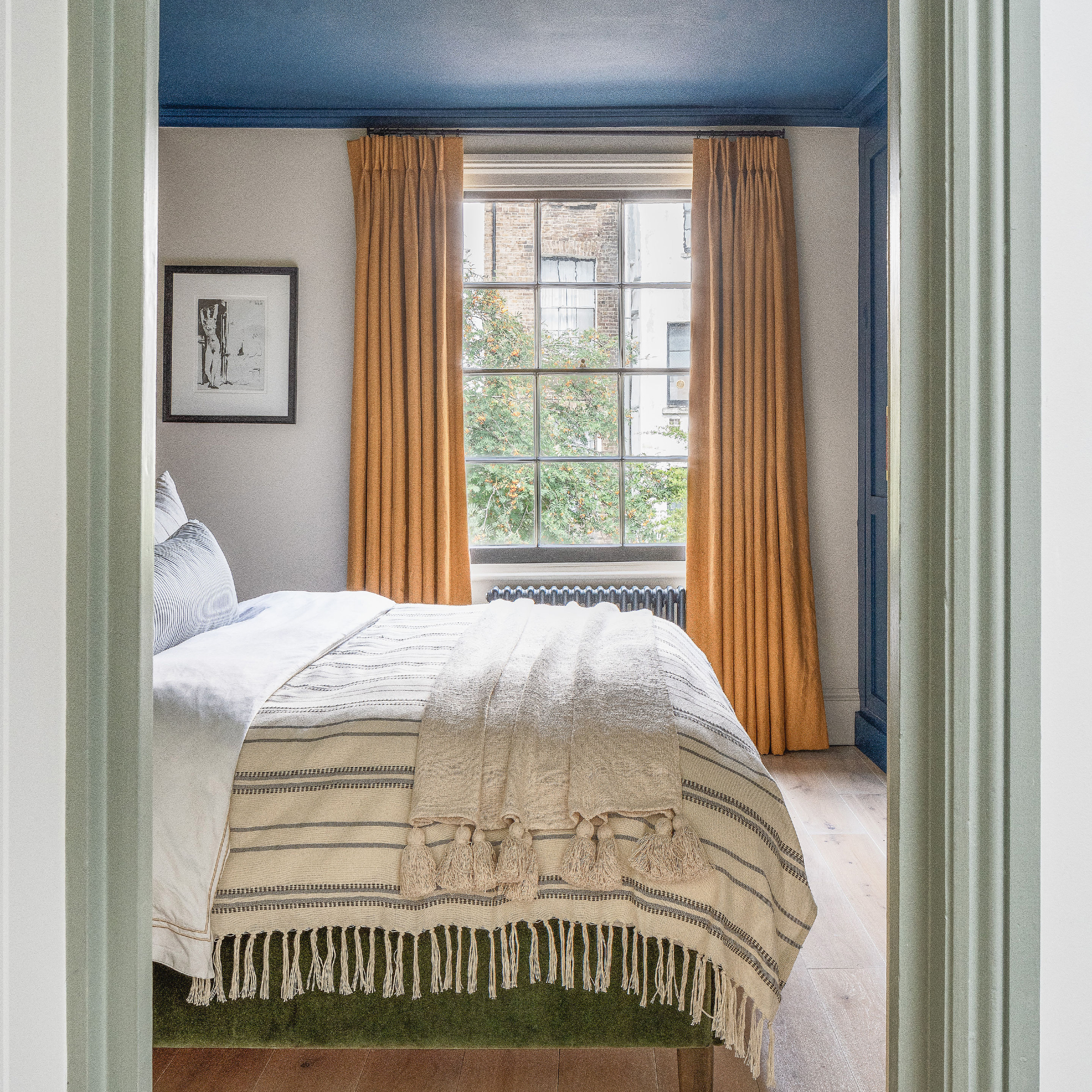
Create a soothing bedroom colour scheme with a twist by painting the ceiling and wardrobe in a beautiful cobalt blue. It's a great choice because it's perhaps one of the warmest shades of blue there is.
Team it with turmeric-coloured curtains and off-white walls for balance. Painted ceilings work well in any room as long as you don't have a low ceiling this is because a darker colour will bring the ceiling down visually, if you want to create the illusion of height pick a lighter shade that has a hint of colour instead.
FAQs
Should accent colours be lighter or darker?
It really does depend on what kind of look you're after, Bailey Oates, colour expert at Earthborn explains: 'A dark accent colour in large, open rooms will add a sense of cosiness that can be hard to acheive in spacious rooms. Lighter accent colours work really well in bathrooms and kitchens as they open up a space and create an energising atmosphere, whereas darker accent colours are at home in living rooms and bedrooms as they exude feelings of relaxation.'
What is a complementary accent colour?
A complementary accent colour is confusingly named, a complementary colour scheme means using colours that contrast with each other. So a complementary accent colour will sit on the opposite side of the colour wheel.
'A complementary accent colour refers to a hue that sits opposite to the dominant colour on the colour wheel. These pairings are thought to naturally harmonise while creating an interesting contrast in an interior scheme,' says Debbie Leigh design manager at ILIV.
'Typically, these are the colours opposite each other on the colour wheel – green and red, yellow and purple, orange and blue, green and pink. Playing with the hues and vibrance of the colours can create a striking colour palette that boasts character and fuses seamlessly with an existing design scheme,' says Bailey Oates, colour expert at Earthborne.
Add some flair and character to your colour scheme with one of these accent colours.